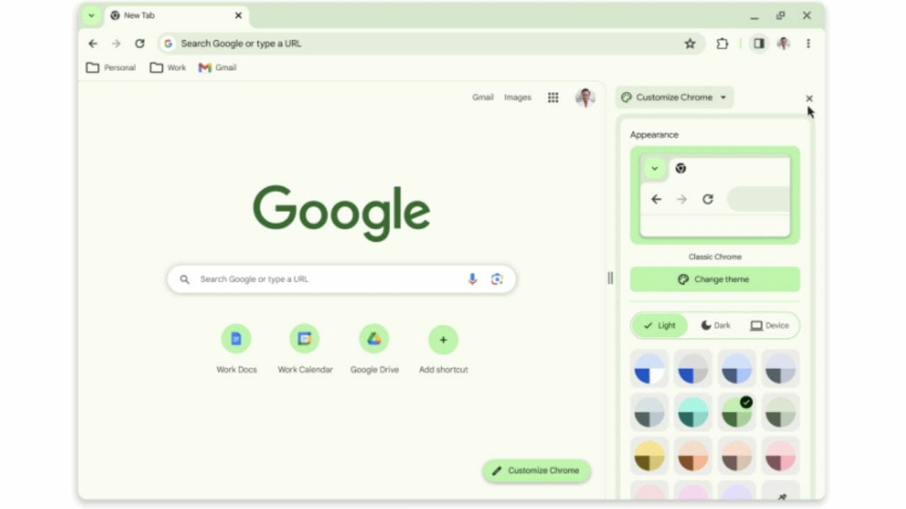
Google Chrome on the desktop is getting a much-needed makeover, inspired by the aesthetic changes Google introduced with Android 12 on smartphones. To celebrate the 15th anniversary of its beloved web browser, Google has announced that it will adopt the Material You design language for the desktop version of Chrome.
This means that Chrome’s desktop interface will no longer be a hodgepodge of colors, rounded corners, and black and white UI elements with boring fonts.
Currently, when you apply a Chrome Web Store theme, it beautifully alters the color scheme of the status bars, URLs, and top bookmarks. However, the rest of the user interface, including the menu box, customization panel, and settings page, remains outdated and lacks color. Fortunately, this is about to change with the introduction of the Material You style in the desktop version of Chrome.
The customization panel will receive significant improvements, including color palette wheels and dedicated buttons to quickly switch between light and dark modes. Of course, there’s also an automatic mode that adapts to system-level color theme preferences. Google has gone the extra mile by updating Chrome icons to improve readability and create new color palettes that better match the tabs and toolbar.
In the ongoing battle against the growing threat of short-lived malicious websites, Google is stepping up its game. They will now perform real-time checks on all new websites that appear on the Internet, comparing them to their database of known malicious URLs. According to Google, this enhanced security measure will provide a 25% improvement in protection against malware and phishing threats.
With these exciting updates, Google Chrome on the desktop will be not only more visually appealing but also more secure for users as it continues to evolve and adapt to the changing online landscape.
The Material You design makeover brings some interesting changes to Chrome’s menu panel. It’s not just about aesthetics; There are several new controls for convenient access. You’ll find options like profile change, one-click browsing data deletion, Google Translate, and Save and Share. Plus, there’s a nifty new feature called “Search this page with Google.” When activated, it opens a dedicated side panel with various web search tools, Google Lens for image details, clickable keywords, and even web page source information at the bottom. This particular feature bears some resemblance to the Bing Chat side panel in Microsoft’s Edge browser.
The Material You update for Chrome is expected to roll out in the coming weeks. If you’re eager to see a preview of what it will look like, you can check out the preview version available on the Chrome Web Store. In addition to the design facelift, the store will also receive some useful categorization controls. Additionally, it’s introducing new sections, including extensions that leverage generative AI tools and an Editor’s Spotlight segment, which highlights the best of the best among Chrome extensions.
Now, on the security front, Google is taking a major step forward. They are expanding their internal security monitoring system to cover browser extensions. In recent years, experts from Avast, IBM Security, and McAfee have consistently raised concerns about malicious Chrome extensions. Despite Google’s efforts to remove them, these extensions still pose serious risks, including arbitrary code injection. While it remains to be seen how effective this security control expansion will be, it is certainly a step in the right direction to strengthen Chrome’s security.
Subscribe to our latest newsletter
To read our exclusive content, register now. $5/Monthly, $50/Yearly
Categories: Technology
Source: vtt.edu.vn
